This week's challenge was to design a dress in Campbell's color palette (yes, like Mmm! Mmm! Good) for their AdDRESS Your Heart campaign. Exactly one half of this challenge was sufficient. Having both components, in my opinion anyway, unnecessarily complicates the issue and hobbles the designers.
 Amy
Amy won with this glorious, floaty dress, unfortunately represented on Lifetime's site with this very bad picture. You were never going to capture the beautiful movement of the dress, that's a given, but this picture really does it no justice. Not only was it extremely flattering, but the model looked so happy to be wearing it for every other moment except, apparently, the one during which this picture was taken. The fabrics were wonderful, she left the gimmicky Campbells fabrics out of it, the dress was perfect for the model, and it came out spectacularly. Brava, Amy!
 Jesus
Jesus got the boot for this thing. I know I am going to hell for this, but I have to say that the model was part of the problem...her whole affect was tilted towards the trashy and when combined with this dress it went right over the edge. The straps might have been nice on a longer detail - the ethereal quality they had was actually quite pretty - but with the short, fitted dress it just looked very Rainbow/Rave/Trashy-Mall-Store-For-Teenagers-Of-Your-Choice. Jesus was making very commercial, fairly bland stuff, and after two weeks of kind of ignoring every directive hucked his way, it was time for him to go.
 Anna
Anna (I hope) squeaked by with this hot mess. The skirt? Very cute. The top however makes the woman look massive, and the fabric choices are horrid. When you're even CLOSE to nude fabrics, you really need to go for the exact match (which would make no sense here) or something different. Not her best work.
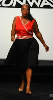
 Anthony's
 garment is suffering from a lot of the same problems as Anna's piece. This makes her look very blocky. However, she seemed to like it and it looked a lot better in motion, so I place this one in the middle of the road. The dress on its own looked really nice and the jacket was mostly unexciting, not necessarily horrible.
 Ben
Ben appears to have turned to the Flintstones' prop shack for this necklace...wasn't Wilma's necklace attached to her dress?? Is she running around naked somewhere?? This just seems to be having an identity crisis. The hair and the length with the slit is clearly old-school glamourpuss red carpet-y, but the belt, the trim along the slit and the necklace are more funky, casual and modern. I like all of the components, but together it's too chaotic and unclear. I also think the slit is a little bit too high and wide for this particular woman; she has AWESOME legs but the slit hits them at a point that makes her look extra wide in the hipular region.
 Emilio's
 dress was really pretty and did NOT make the model look pregnant at the time, but this photo is weird. I loved the detail at the bust and I think the whole thing hits a tricky balance between cute and sophisticated with the bubble skirt. If Amy's dress hadn't been so wonderful, I think this would have had a shot at the top two or three, given the challenge.
 Janeane Marie's
 dress was really pretty and made good use of the fabrics, but AGAIN the photographers are on a mission to ugly up these poor ladies. Yikes. This woman looked really great in this dress, and I liked both the fabric decoration at the bustline and the way she continued it with a reference in the underskirt.
 Jay Nicolas'
 dress kind of bored me, but his model looked so freaking joyful in it that it more than compensated for the pedestrian design. The design wasn't BAD, but I do have some concerns about the fit of the bodice. It looked particularly ill-fitting when it was in motion. I'll reserve judgment on Jay Nicolas for now, but he's really going to have to step it up if he wants to continue.
 Jesse's
 outfit was very cute, even if the styling sucked. I really liked the cardigan over the satiny fabric and the rosette was just enough to tie it all together. It wasn't a total showstopper, but it looked wonderful on her and it was infinitely wearable. So far Jesse has been very solid, but he's another one I think will need to ramp up his fabulosity quotient if he's going to stick around.
 Jonathan
 went with a much deeper red than most and the result was superdramatic. His model looked like eight feet of asskicking female warrior, and the movement of the dress totally befit the initial impression. The bodice was lovely on her, and the skinny belt gave the whole thing a chic polish. I really loved this one.
 Maya's
 dress was interesting but it lacked the grace of really excellent draping. I think she was the one who best handled the colors they were handed, which were kind of gross. They might work on a Campbell's can but woof, no good in clothing form. In its current iteration, the stiffness of the draping does look interesting in a certain way, but it doesn't look like it's intentional, which is the real problem. It kind of looks like when I say "oh dammit, I don't even care, I'm just going to tape this on here" in the middle of an art project. I think this just needs a little finesse.
 Mila's
 dress was tricky for me, because I responded positively to it, but it's SO costumey. I believe one of the judges mentioned that stopping at one star would have made a big difference and I think there's probably something to that. She really took the branding to heart and managed to do it in a way that was creative. The neckline is beautiful on this woman, too. I guess my own personal jury is out.
 Seth Aaron
 had some more crappy styling. I thought this was okay but bland. It's inoffensive, but the top is edging towards a bad cut on this particular model. Not good enough, but not offensively bad. Yet another stepper-upper!

 Amy won with this glorious, floaty dress, unfortunately represented on Lifetime's site with this very bad picture. You were never going to capture the beautiful movement of the dress, that's a given, but this picture really does it no justice. Not only was it extremely flattering, but the model looked so happy to be wearing it for every other moment except, apparently, the one during which this picture was taken. The fabrics were wonderful, she left the gimmicky Campbells fabrics out of it, the dress was perfect for the model, and it came out spectacularly. Brava, Amy!
 Jesus got the boot for this thing. I know I am going to hell for this, but I have to say that the model was part of the problem...her whole affect was tilted towards the trashy and when combined with this dress it went right over the edge. The straps might have been nice on a longer detail - the ethereal quality they had was actually quite pretty - but with the short, fitted dress it just looked very Rainbow/Rave/Trashy-Mall-Store-For-Teenagers-Of-Your-Choice. Jesus was making very commercial, fairly bland stuff, and after two weeks of kind of ignoring every directive hucked his way, it was time for him to go.
 Anna (I hope) squeaked by with this hot mess. The skirt? Very cute. The top however makes the woman look massive, and the fabric choices are horrid. When you're even CLOSE to nude fabrics, you really need to go for the exact match (which would make no sense here) or something different. Not her best work.
 Anthony's garment is suffering from a lot of the same problems as Anna's piece. This makes her look very blocky. However, she seemed to like it and it looked a lot better in motion, so I place this one in the middle of the road. The dress on its own looked really nice and the jacket was mostly unexciting, not necessarily horrible.
 Ben appears to have turned to the Flintstones' prop shack for this necklace...wasn't Wilma's necklace attached to her dress?? Is she running around naked somewhere?? This just seems to be having an identity crisis. The hair and the length with the slit is clearly old-school glamourpuss red carpet-y, but the belt, the trim along the slit and the necklace are more funky, casual and modern. I like all of the components, but together it's too chaotic and unclear. I also think the slit is a little bit too high and wide for this particular woman; she has AWESOME legs but the slit hits them at a point that makes her look extra wide in the hipular region.
 Emilio's dress was really pretty and did NOT make the model look pregnant at the time, but this photo is weird. I loved the detail at the bust and I think the whole thing hits a tricky balance between cute and sophisticated with the bubble skirt. If Amy's dress hadn't been so wonderful, I think this would have had a shot at the top two or three, given the challenge.
 Janeane Marie's dress was really pretty and made good use of the fabrics, but AGAIN the photographers are on a mission to ugly up these poor ladies. Yikes. This woman looked really great in this dress, and I liked both the fabric decoration at the bustline and the way she continued it with a reference in the underskirt.
 Jay Nicolas' dress kind of bored me, but his model looked so freaking joyful in it that it more than compensated for the pedestrian design. The design wasn't BAD, but I do have some concerns about the fit of the bodice. It looked particularly ill-fitting when it was in motion. I'll reserve judgment on Jay Nicolas for now, but he's really going to have to step it up if he wants to continue.
 Jesse's outfit was very cute, even if the styling sucked. I really liked the cardigan over the satiny fabric and the rosette was just enough to tie it all together. It wasn't a total showstopper, but it looked wonderful on her and it was infinitely wearable. So far Jesse has been very solid, but he's another one I think will need to ramp up his fabulosity quotient if he's going to stick around.
 Jonathan went with a much deeper red than most and the result was superdramatic. His model looked like eight feet of asskicking female warrior, and the movement of the dress totally befit the initial impression. The bodice was lovely on her, and the skinny belt gave the whole thing a chic polish. I really loved this one.
 Maya's dress was interesting but it lacked the grace of really excellent draping. I think she was the one who best handled the colors they were handed, which were kind of gross. They might work on a Campbell's can but woof, no good in clothing form. In its current iteration, the stiffness of the draping does look interesting in a certain way, but it doesn't look like it's intentional, which is the real problem. It kind of looks like when I say "oh dammit, I don't even care, I'm just going to tape this on here" in the middle of an art project. I think this just needs a little finesse.
 Mila's dress was tricky for me, because I responded positively to it, but it's SO costumey. I believe one of the judges mentioned that stopping at one star would have made a big difference and I think there's probably something to that. She really took the branding to heart and managed to do it in a way that was creative. The neckline is beautiful on this woman, too. I guess my own personal jury is out.
 Seth Aaron had some more crappy styling. I thought this was okay but bland. It's inoffensive, but the top is edging towards a bad cut on this particular model. Not good enough, but not offensively bad. Yet another stepper-upper!


No comments:
Post a Comment