
This Thursday, Project Runway crowned it's eighth winner for the show, second on Lifetime. The Lucy and I, sadly, did not critique the entire season because as it turns out, grad school programs take up a lot of your time (and bee tee dubs: congratulations to the lovely and amazing The Lucy on her newly minted MFA in Creative Writing!), but both of us were Team Mondo more or less from go. Gretchen Jones' collection was picked at the winner, and the world went apeshit.
First and foremost, here are the collections, courtesy of NY Mag.
Mondo Guerra
Gretchen Jones
Andy South
I was surprised throughout the judging process. I freely admit that I assumed that Mondo would win because he was such a complete competitor: a talented fabricator with a strong fashion point of view tempered by an openness to evolution in design. When I saw the three collections, I assumed it would be between Andy and Mondo. Andy's was not as various a collection as one would have hoped, but it presented a clear statement and was masterfully constructed. He made excellent use of texture in his fabrics and despite minimal color, the collection was never boring. Gretchen's was...more Gretchen. All season, she's been making the kind of stuff you'd expect on a resident of Taos, New Mexico who talks about crystals a lot and lives in an adobe house, but vacations in Aspen and drives a Land Rover, all in baby-poo colors. It was very cohesive and Gretchen is a great clothesmaker, but it was a snooze. AND it featured some kind of weird granny panties repeatedly, in the guise of pants. Mondo's collection was a blast. He used the over the top imagery of the Day of the Dead and old Mexican circuses but somehow wove it into a sophisticated, fun collection awash in his wonderful prints. It was spectacular and distinctive.
Then Gretchen won.
Project Runway, at its current level, features designers who are talented. This is an important thing to remember, because a lot of invective has been hurled at Gretchen that takes the form of accusations of incompetence. This isn't the case. She is a talented dressmaker, she is a talented designer, and she has original ideas. I personally would not let 95% of her stuff come anywhere near my body, but that's different from a lack of talent. No one is going to win Project Runway without a base level of talent, and Gretchen absolutely has it.
However, there is a larger question of What The Point Is. The stated goal of Project Runway has always been "finding the next great fashion designer." For the past several seasons, I think that the selections have been appropriate, even if they didn't go on to dominate the fashion world (which, incidentally, I don't think is possible or positive in fashion, so I actually count this as a good thing, even if I wish some of them would have made more of a splash in runway fashion). But this year, Gretchen won because she was "on trend" and basically because she was mass marketable, and that poses a real problem for Project Runway. I agree that Gretchen's collection was marketable...Nina Garcia and Michael Kors weren't wrong about that, as many people have been whining. The problem is, it looked like a goddamn Chico's. But there already is a Chico's, and frankly I'm not sure that Gretchen improves on the genre. If they wanted a unique, new voice, Mondo was the clear choice, as demonstrated not only in his final collection but throughout the show.
This all feeds directly into a conspiracy theory that The Lucy touched off a while back, which has now grown exponentially in my mind as evidence mounts. The idea is that Lifetime wants Project Runway shoehorned into its specific formula, the same one that brought the world all those classic Lifetime movies and various sexist-stereotypes-dressed-as-empowerment offerings. The first season that aired on Lifetime had been filmed before the switch from Bravo had been finalized, and thus had retained much of its original feel. This is the first season completely filmed under Lifetime's auspices, and it shows. The switch to the Bunim/Murray editing crew brought the jumpy feel of the house's other shows to Project Runway, which made this year's runway shows wildly irritating; the constant cuts and weird camera angles made it all but impossible to actually see the clothes completely. I also feel that Tim Gunn has been edited into a "safer" and more stereotypical picture of a gay man - a fey gay stereotype operating mostly on quips and light on seriousness, rather than the spectacularly knowledgeable, intelligent and unique human being that people have responded so well to from day one. This is not to say that some of the latter doesn't shine through - you can't take the awesome out of Tim Gunn - but I have noticed a specific and dramatic shift, and I find that deeply upsetting.
Perhaps the most worrying aspect of this is how Gretchen's win fits into the gradual Lifetimization of Project Runway. The discussion of the collections focused for the first time mostly on mass marketability, rather than creativity and big fashion. This fits right into the trend towards removing everything gutsy and challenging about Project Runway. Rather than watching the way aspirational fashion is created, we are now watching how shit you can buy at the mall gets produced. I fail to see either the benefit or the appeal of such a show. It's not that Gretchen is untalented, as I have said before - it's that she's not making fashion and she's not bringing anything new to the table. I am concerned about the future of Project Runway, and I think it would be a great loss for it to decay into cancellation.
Showing posts with label project runway. Show all posts
Showing posts with label project runway. Show all posts
Saturday, October 30, 2010

Thursday, February 25, 2010
Project Runway: A Little Bit of Fashion
The challenge: to make an outfit for a little girl and one to match for her mom.
Question: Did the designers act like little bitches about having to design for someone who is not a size 00 model?
Answer: Kind of. Lots of comments about not liking children, etc. However, they got their acts together eventually and did just fine.
 Seth Aaron won the challenge while being extremely cute about his own daughter and how proud she would be of him, which made it that much better. I actually didn't love the little girl outfit - it seemed kind of generic to me - but WHOA Mom Outfit. The motorcycle jacket as freaking gorgeous and I even liked the pants. I love the patterning and the uberflattering cut. I WANT it.
 Janeane Marie lost for creating a lot of unflattering junk. I can't really argue with the aufing, but I will say I didn't think the little girl's outfit was so bad, just kind of boring.
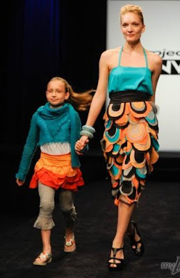 Amy got reamed on these pants, but I have to admit that I kind of like them. A couple people have suggested that a different color combo would have helped but I actually like the coral and teal look. It seems very Floridian to me...which might explain my affinity for them, actually, since I'm thinking about my upcoming Florida vacation. The little girl's outfit, however, was quite atrocious, and I thought so even before I saw that the leggings end in a RUFFLE. Dodged a bullet there, Amy my love.
 Anthony didn't go as matchy-matchy as the other designers and what the combo lacks in coherence it makes up for in cuteness. The mom dress is a little boring (and the styling is effing disgusting. You couldn't have WASHED her hair???) but it's well made and fits beautifully. The little girl's dress is very sweet, and I like the fairly sophisticated print on the bodice. It's a nice effect and the model seemed to like it.
 Ben didn't match either but this was much rougher. The little girl looks like she's wearing a costume for some production of a Dickensian work with that washed out color and shapeless cut. The Mom skirt is nice but the top is weirdly blocky and I don't think I like it, even though I do enjoy the color palette.
 Emilio produced a superchic look for the Mom and a very cute little dress for the girl. I love the classic dress with the funky assymetrical neckline on the adult model. The little girl's dress is sweet but I wish it had been closer fitted in the bodice and more lively in the skirt. Solid effort and frankly the first "WOW" piece from Emilio.
 Jay Nicolas did some nice work here. I liked the casual look he offered up, and the ruffly detailing looked great. The little girl's outfit is funky and although I was initially horrified because I thought the pockets were cutouts, now that I know they are in fact pockets they are a neat idea. I could probably live without the scarf, but it's not a look killer.
 Jesse came up with this cute Madeline-on-Crack look and I thought it was just great. I appreciate that he took a very classic, school-uniformy look and instead of having to completely revolutionize it, he just skewed it a little bit so it's still recognizable. Love it. The Mom outfit is amazing too...the tailoring is stunning and the design is wonderful. I love the color palette, too!
 Jonathan got slammed harder than I thought necessary. I think there's a little dissonance between the intent of the two garments; the Mom looks like she's going to a fancy cocktail party, while the daughter looks like she's going to a pretty standard kid birthday. I think the Mom dress would have gotten more props if it wasn't white. The little girl's bolero is probably unnecessary but I actually think that the dress is really sweet and I love the sunny yellow.
 Maya made a very little-kid-y kid outfit, which was plenty cute but not really exceptional. The Mom pants were similarly cute-but-boring, but the jacket was very cool. I wish it wasn't a midriff-baring jacket, however. The shoes on Mom are teriffic with the outfit.
 Mila went over cutesy on the little girl...it's like some kind of nightmare 101 Dalmatian/Flintstones hybrid. The Mom's jacket looks like a freaking tent, and the only thing even INTERESTING is the pair of leggings...and those make her legs look huge. Bad news all around.
Question: Did the designers act like little bitches about having to design for someone who is not a size 00 model?
Answer: Kind of. Lots of comments about not liking children, etc. However, they got their acts together eventually and did just fine.
 Seth Aaron won the challenge while being extremely cute about his own daughter and how proud she would be of him, which made it that much better. I actually didn't love the little girl outfit - it seemed kind of generic to me - but WHOA Mom Outfit. The motorcycle jacket as freaking gorgeous and I even liked the pants. I love the patterning and the uberflattering cut. I WANT it.
 Janeane Marie lost for creating a lot of unflattering junk. I can't really argue with the aufing, but I will say I didn't think the little girl's outfit was so bad, just kind of boring.
 Amy got reamed on these pants, but I have to admit that I kind of like them. A couple people have suggested that a different color combo would have helped but I actually like the coral and teal look. It seems very Floridian to me...which might explain my affinity for them, actually, since I'm thinking about my upcoming Florida vacation. The little girl's outfit, however, was quite atrocious, and I thought so even before I saw that the leggings end in a RUFFLE. Dodged a bullet there, Amy my love.
 Anthony didn't go as matchy-matchy as the other designers and what the combo lacks in coherence it makes up for in cuteness. The mom dress is a little boring (and the styling is effing disgusting. You couldn't have WASHED her hair???) but it's well made and fits beautifully. The little girl's dress is very sweet, and I like the fairly sophisticated print on the bodice. It's a nice effect and the model seemed to like it.
 Ben didn't match either but this was much rougher. The little girl looks like she's wearing a costume for some production of a Dickensian work with that washed out color and shapeless cut. The Mom skirt is nice but the top is weirdly blocky and I don't think I like it, even though I do enjoy the color palette.
 Emilio produced a superchic look for the Mom and a very cute little dress for the girl. I love the classic dress with the funky assymetrical neckline on the adult model. The little girl's dress is sweet but I wish it had been closer fitted in the bodice and more lively in the skirt. Solid effort and frankly the first "WOW" piece from Emilio.
 Jay Nicolas did some nice work here. I liked the casual look he offered up, and the ruffly detailing looked great. The little girl's outfit is funky and although I was initially horrified because I thought the pockets were cutouts, now that I know they are in fact pockets they are a neat idea. I could probably live without the scarf, but it's not a look killer.
  Jesse came up with this cute Madeline-on-Crack look and I thought it was just great. I appreciate that he took a very classic, school-uniformy look and instead of having to completely revolutionize it, he just skewed it a little bit so it's still recognizable. Love it. The Mom outfit is amazing too...the tailoring is stunning and the design is wonderful. I love the color palette, too!
 Jonathan got slammed harder than I thought necessary. I think there's a little dissonance between the intent of the two garments; the Mom looks like she's going to a fancy cocktail party, while the daughter looks like she's going to a pretty standard kid birthday. I think the Mom dress would have gotten more props if it wasn't white. The little girl's bolero is probably unnecessary but I actually think that the dress is really sweet and I love the sunny yellow.
 Maya made a very little-kid-y kid outfit, which was plenty cute but not really exceptional. The Mom pants were similarly cute-but-boring, but the jacket was very cool. I wish it wasn't a midriff-baring jacket, however. The shoes on Mom are teriffic with the outfit.
 Mila went over cutesy on the little girl...it's like some kind of nightmare 101 Dalmatian/Flintstones hybrid. The Mom's jacket looks like a freaking tent, and the only thing even INTERESTING is the pair of leggings...and those make her legs look huge. Bad news all around.
Sunday, February 21, 2010
Project Runway: Run for Cover
This week's challenge asked the designers to come up with a look for Heidi Klum to wear on the cover of Marie Claire. Some Anonymous Internet Person commented that they were surprised that it had taken so long for PR to get to this kind of challenge, and I have to agree...you have Heidi, you have Ninagarcia...shouldn't this have come to pass before?? In any case, it was a fun challenge with real stakes, which always amps up the intensity.
 Anthony was the winner with this cute little number in a pretty, icy blue. He hit just the right color, with enough visual interest for a cool cover that doesn't overwhelm the model. I still want to smack him a lot of the time, but the outfit is terrific! I like the funky bracelet too.
 Anna got the boot for this. I have no complaints, that shit is depressing. The sad little jacket...the limp details on the shirt...the snoozetastic hair? Ugh. I want to go cry alone in the rain just looking at it.
 Amy made this beautiful dress despite the Marie Claire lady specifically saying they didn't like print, but...wouldn't you buy a magazine with this dress on it? The shoes are not great but I love the fabric and the little detail on the bodice. Really lovely, and I wish I could own it. Well, I say I want to, but those hemlines always look weird on me. The long corners create a quasi-arrow of leg that seems to be yelling "LOOK AT MY VAGINA" and while I can rock a lot of things, I cannot rock that.
 Ben's dress was rightfully praised; I'm guessing that the judges zeroed right in on this one and Anthony's and spent most of their time trying to figure out how the hell they could pick just one. I love the color palette - especially the luscious yellow - and the cut is really beautiful. The styling is hideous, because that is the theme this season apparently, but the dress is a knockout. This is another one I would buy in a heartbeat.
 Emilio continues to not really get it. This is pretty in a way (a ballerina way, specifically) but it's not enough for a magazine cover. The neckline is really wonky for me. I want to say that it's too low, but I think it might be the shape of it as well. Whatever it is, it's not working for me, and that didn't change even when they had him get rid of those little snippits on the shoulders. Also...I didn't notice this when the episode aired, but WTF is with those SHOES? It's like "ballerina, ballerina, ballerina, WOW SHORT, ballerina, PUNK."
 Janeane Marie was probably thinking the shot for the cover would be waist up, and I commend her for thinking of that, but you can't just stop the interest after the expected cutoff on a photo. If she had worked in the teal at the bottom of the dress it might be more coherent but it's just kind of bland. The movement was pretty and she might have been on to something with the colors, but the end result wasn't what it could have been.
 Jay Nicolas should have picked a different color. It wouldn't have won him the challenge, most likely, but it would have gotten him further up in the ranks. As Rich said, "maybe if it was a video he would have won." The movement on this was beautiful and I was glad that the editors included a side shot as it was moving down the runway...freakin' poetry in motion right there. I wonder what kind of fabric he used. Nice work from Jay.
 Jesse came up with this fairly severe number...I think it might be more interesting than it seems at first glance, but first glance is what you base your magazine purchases on. This is a great dress for going out, but not quite the right genre for a Marie Claire cover. I do like the weaving/patterning on the midsection!
 Jonathan put this one on deck. I'm having a really hard time getting past the 70s rollerskating shorts, but the more I look at it the more I like it. Check out the pretty twisted belt thinger going on there! To be honest, I don't know how great it would be on Heidi - I think it might wash her out - but it's a sweet, clear look.
 Maya's dress was a complete snore. I think she was another one thinking of a waist up shot, or at least I HOPE she was. Unfortunately, the top isn't that interesting either. I like the structure of it, but the colors are awful. The hemline is gross too. It reminds me of those jean skirts that people used to wear where you basically cut a pair of jeans open and then sewed a panel between the legs. Not a good memory.
 Mila's dress looked like it was from a challenge where you had to make a dress out of your shapewear. This is most disappointing because it would have been really cool in some better colors. Again, I still don't know that it would have made it a winner, but it would have improved the situation.
 Seth Aaron at least has a client...Trinity from the Matrix. I get what he's going for here but with the small pops of color it's just very unbalanced and way too severe. It looks like it's well made but it's just not that great designwise.
 Anthony was the winner with this cute little number in a pretty, icy blue. He hit just the right color, with enough visual interest for a cool cover that doesn't overwhelm the model. I still want to smack him a lot of the time, but the outfit is terrific! I like the funky bracelet too.
  Anna got the boot for this. I have no complaints, that shit is depressing. The sad little jacket...the limp details on the shirt...the snoozetastic hair? Ugh. I want to go cry alone in the rain just looking at it.
 Amy made this beautiful dress despite the Marie Claire lady specifically saying they didn't like print, but...wouldn't you buy a magazine with this dress on it? The shoes are not great but I love the fabric and the little detail on the bodice. Really lovely, and I wish I could own it. Well, I say I want to, but those hemlines always look weird on me. The long corners create a quasi-arrow of leg that seems to be yelling "LOOK AT MY VAGINA" and while I can rock a lot of things, I cannot rock that.
 Ben's dress was rightfully praised; I'm guessing that the judges zeroed right in on this one and Anthony's and spent most of their time trying to figure out how the hell they could pick just one. I love the color palette - especially the luscious yellow - and the cut is really beautiful. The styling is hideous, because that is the theme this season apparently, but the dress is a knockout. This is another one I would buy in a heartbeat.
 Emilio continues to not really get it. This is pretty in a way (a ballerina way, specifically) but it's not enough for a magazine cover. The neckline is really wonky for me. I want to say that it's too low, but I think it might be the shape of it as well. Whatever it is, it's not working for me, and that didn't change even when they had him get rid of those little snippits on the shoulders. Also...I didn't notice this when the episode aired, but WTF is with those SHOES? It's like "ballerina, ballerina, ballerina, WOW SHORT, ballerina, PUNK."
  Janeane Marie was probably thinking the shot for the cover would be waist up, and I commend her for thinking of that, but you can't just stop the interest after the expected cutoff on a photo. If she had worked in the teal at the bottom of the dress it might be more coherent but it's just kind of bland. The movement was pretty and she might have been on to something with the colors, but the end result wasn't what it could have been.
  Jay Nicolas should have picked a different color. It wouldn't have won him the challenge, most likely, but it would have gotten him further up in the ranks. As Rich said, "maybe if it was a video he would have won." The movement on this was beautiful and I was glad that the editors included a side shot as it was moving down the runway...freakin' poetry in motion right there. I wonder what kind of fabric he used. Nice work from Jay.
 Jesse came up with this fairly severe number...I think it might be more interesting than it seems at first glance, but first glance is what you base your magazine purchases on. This is a great dress for going out, but not quite the right genre for a Marie Claire cover. I do like the weaving/patterning on the midsection!
 Jonathan put this one on deck. I'm having a really hard time getting past the 70s rollerskating shorts, but the more I look at it the more I like it. Check out the pretty twisted belt thinger going on there! To be honest, I don't know how great it would be on Heidi - I think it might wash her out - but it's a sweet, clear look.
  Maya's dress was a complete snore. I think she was another one thinking of a waist up shot, or at least I HOPE she was. Unfortunately, the top isn't that interesting either. I like the structure of it, but the colors are awful. The hemline is gross too. It reminds me of those jean skirts that people used to wear where you basically cut a pair of jeans open and then sewed a panel between the legs. Not a good memory.
 Mila's dress looked like it was from a challenge where you had to make a dress out of your shapewear. This is most disappointing because it would have been really cool in some better colors. Again, I still don't know that it would have made it a winner, but it would have improved the situation.
 Seth Aaron at least has a client...Trinity from the Matrix. I get what he's going for here but with the small pops of color it's just very unbalanced and way too severe. It looks like it's well made but it's just not that great designwise.
Wednesday, February 17, 2010
Project Runway: Design Your Heart Out
This week's challenge was to design a dress in Campbell's color palette (yes, like Mmm! Mmm! Good) for their AdDRESS Your Heart campaign. Exactly one half of this challenge was sufficient. Having both components, in my opinion anyway, unnecessarily complicates the issue and hobbles the designers.
 Amy won with this glorious, floaty dress, unfortunately represented on Lifetime's site with this very bad picture. You were never going to capture the beautiful movement of the dress, that's a given, but this picture really does it no justice. Not only was it extremely flattering, but the model looked so happy to be wearing it for every other moment except, apparently, the one during which this picture was taken. The fabrics were wonderful, she left the gimmicky Campbells fabrics out of it, the dress was perfect for the model, and it came out spectacularly. Brava, Amy!
 Jesus got the boot for this thing. I know I am going to hell for this, but I have to say that the model was part of the problem...her whole affect was tilted towards the trashy and when combined with this dress it went right over the edge. The straps might have been nice on a longer detail - the ethereal quality they had was actually quite pretty - but with the short, fitted dress it just looked very Rainbow/Rave/Trashy-Mall-Store-For-Teenagers-Of-Your-Choice. Jesus was making very commercial, fairly bland stuff, and after two weeks of kind of ignoring every directive hucked his way, it was time for him to go.
 Anna (I hope) squeaked by with this hot mess. The skirt? Very cute. The top however makes the woman look massive, and the fabric choices are horrid. When you're even CLOSE to nude fabrics, you really need to go for the exact match (which would make no sense here) or something different. Not her best work.
 Anthony's garment is suffering from a lot of the same problems as Anna's piece. This makes her look very blocky. However, she seemed to like it and it looked a lot better in motion, so I place this one in the middle of the road. The dress on its own looked really nice and the jacket was mostly unexciting, not necessarily horrible.
 Ben appears to have turned to the Flintstones' prop shack for this necklace...wasn't Wilma's necklace attached to her dress?? Is she running around naked somewhere?? This just seems to be having an identity crisis. The hair and the length with the slit is clearly old-school glamourpuss red carpet-y, but the belt, the trim along the slit and the necklace are more funky, casual and modern. I like all of the components, but together it's too chaotic and unclear. I also think the slit is a little bit too high and wide for this particular woman; she has AWESOME legs but the slit hits them at a point that makes her look extra wide in the hipular region.
 Emilio's dress was really pretty and did NOT make the model look pregnant at the time, but this photo is weird. I loved the detail at the bust and I think the whole thing hits a tricky balance between cute and sophisticated with the bubble skirt. If Amy's dress hadn't been so wonderful, I think this would have had a shot at the top two or three, given the challenge.
 Janeane Marie's dress was really pretty and made good use of the fabrics, but AGAIN the photographers are on a mission to ugly up these poor ladies. Yikes. This woman looked really great in this dress, and I liked both the fabric decoration at the bustline and the way she continued it with a reference in the underskirt.
 Jay Nicolas' dress kind of bored me, but his model looked so freaking joyful in it that it more than compensated for the pedestrian design. The design wasn't BAD, but I do have some concerns about the fit of the bodice. It looked particularly ill-fitting when it was in motion. I'll reserve judgment on Jay Nicolas for now, but he's really going to have to step it up if he wants to continue.
 Jesse's outfit was very cute, even if the styling sucked. I really liked the cardigan over the satiny fabric and the rosette was just enough to tie it all together. It wasn't a total showstopper, but it looked wonderful on her and it was infinitely wearable. So far Jesse has been very solid, but he's another one I think will need to ramp up his fabulosity quotient if he's going to stick around.
 Jonathan went with a much deeper red than most and the result was superdramatic. His model looked like eight feet of asskicking female warrior, and the movement of the dress totally befit the initial impression. The bodice was lovely on her, and the skinny belt gave the whole thing a chic polish. I really loved this one.
 Maya's dress was interesting but it lacked the grace of really excellent draping. I think she was the one who best handled the colors they were handed, which were kind of gross. They might work on a Campbell's can but woof, no good in clothing form. In its current iteration, the stiffness of the draping does look interesting in a certain way, but it doesn't look like it's intentional, which is the real problem. It kind of looks like when I say "oh dammit, I don't even care, I'm just going to tape this on here" in the middle of an art project. I think this just needs a little finesse.
 Mila's dress was tricky for me, because I responded positively to it, but it's SO costumey. I believe one of the judges mentioned that stopping at one star would have made a big difference and I think there's probably something to that. She really took the branding to heart and managed to do it in a way that was creative. The neckline is beautiful on this woman, too. I guess my own personal jury is out.
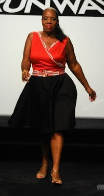 Seth Aaron had some more crappy styling. I thought this was okay but bland. It's inoffensive, but the top is edging towards a bad cut on this particular model. Not good enough, but not offensively bad. Yet another stepper-upper!
 Amy won with this glorious, floaty dress, unfortunately represented on Lifetime's site with this very bad picture. You were never going to capture the beautiful movement of the dress, that's a given, but this picture really does it no justice. Not only was it extremely flattering, but the model looked so happy to be wearing it for every other moment except, apparently, the one during which this picture was taken. The fabrics were wonderful, she left the gimmicky Campbells fabrics out of it, the dress was perfect for the model, and it came out spectacularly. Brava, Amy!
 Jesus got the boot for this thing. I know I am going to hell for this, but I have to say that the model was part of the problem...her whole affect was tilted towards the trashy and when combined with this dress it went right over the edge. The straps might have been nice on a longer detail - the ethereal quality they had was actually quite pretty - but with the short, fitted dress it just looked very Rainbow/Rave/Trashy-Mall-Store-For-Teenagers-Of-Your-Choice. Jesus was making very commercial, fairly bland stuff, and after two weeks of kind of ignoring every directive hucked his way, it was time for him to go.
 Anna (I hope) squeaked by with this hot mess. The skirt? Very cute. The top however makes the woman look massive, and the fabric choices are horrid. When you're even CLOSE to nude fabrics, you really need to go for the exact match (which would make no sense here) or something different. Not her best work.
 Anthony's garment is suffering from a lot of the same problems as Anna's piece. This makes her look very blocky. However, she seemed to like it and it looked a lot better in motion, so I place this one in the middle of the road. The dress on its own looked really nice and the jacket was mostly unexciting, not necessarily horrible.
 Ben appears to have turned to the Flintstones' prop shack for this necklace...wasn't Wilma's necklace attached to her dress?? Is she running around naked somewhere?? This just seems to be having an identity crisis. The hair and the length with the slit is clearly old-school glamourpuss red carpet-y, but the belt, the trim along the slit and the necklace are more funky, casual and modern. I like all of the components, but together it's too chaotic and unclear. I also think the slit is a little bit too high and wide for this particular woman; she has AWESOME legs but the slit hits them at a point that makes her look extra wide in the hipular region.
 Emilio's dress was really pretty and did NOT make the model look pregnant at the time, but this photo is weird. I loved the detail at the bust and I think the whole thing hits a tricky balance between cute and sophisticated with the bubble skirt. If Amy's dress hadn't been so wonderful, I think this would have had a shot at the top two or three, given the challenge.
 Janeane Marie's dress was really pretty and made good use of the fabrics, but AGAIN the photographers are on a mission to ugly up these poor ladies. Yikes. This woman looked really great in this dress, and I liked both the fabric decoration at the bustline and the way she continued it with a reference in the underskirt.
 Jay Nicolas' dress kind of bored me, but his model looked so freaking joyful in it that it more than compensated for the pedestrian design. The design wasn't BAD, but I do have some concerns about the fit of the bodice. It looked particularly ill-fitting when it was in motion. I'll reserve judgment on Jay Nicolas for now, but he's really going to have to step it up if he wants to continue.
 Jesse's outfit was very cute, even if the styling sucked. I really liked the cardigan over the satiny fabric and the rosette was just enough to tie it all together. It wasn't a total showstopper, but it looked wonderful on her and it was infinitely wearable. So far Jesse has been very solid, but he's another one I think will need to ramp up his fabulosity quotient if he's going to stick around.
 Jonathan went with a much deeper red than most and the result was superdramatic. His model looked like eight feet of asskicking female warrior, and the movement of the dress totally befit the initial impression. The bodice was lovely on her, and the skinny belt gave the whole thing a chic polish. I really loved this one.
 Maya's dress was interesting but it lacked the grace of really excellent draping. I think she was the one who best handled the colors they were handed, which were kind of gross. They might work on a Campbell's can but woof, no good in clothing form. In its current iteration, the stiffness of the draping does look interesting in a certain way, but it doesn't look like it's intentional, which is the real problem. It kind of looks like when I say "oh dammit, I don't even care, I'm just going to tape this on here" in the middle of an art project. I think this just needs a little finesse.
 Mila's dress was tricky for me, because I responded positively to it, but it's SO costumey. I believe one of the judges mentioned that stopping at one star would have made a big difference and I think there's probably something to that. She really took the branding to heart and managed to do it in a way that was creative. The neckline is beautiful on this woman, too. I guess my own personal jury is out.
 Seth Aaron had some more crappy styling. I thought this was okay but bland. It's inoffensive, but the top is edging towards a bad cut on this particular model. Not good enough, but not offensively bad. Yet another stepper-upper!
Tuesday, February 16, 2010
Project Runway: The Highs and Lows of Fashion
Do you ever think about how many things are in the world? Think about what you're wearing right now...probably pants, a shirt, maybe a dress or a skirt, some kind of underwear. These are all things we can easily identify, but just think of how many billions of permutations of "pants" there are and have been in the world. Jeans, slacks, trousers, sweatpants...boot cut, skinny, boyfriend, pleated...denim, cotton, wool, linen...beaded, tuxedo, pinstriped, plaid. It could go on forever, and that's just pants. I thought about this a lot during episode three, because my God were the selections from The Met's Costume Institute spectacular...
 I want to start this post with some discussion of the pieces that were meant to inspire the designers because even though there's a tendency to dismiss fashion as frivolous, and I think many of these provide evidence to the contrary. Fashion is about making you feel something in your gut, either by looking at it or wearing it, and the way we choose to utilize those feelings can help us proclaim to the world who we are.
 This is a Pauline Trigiere dress from 1966, worked in silk, wool and feathers. I'll be honest...I would not wear this, but I can appreciate the workmanship in it and the attention to detail. It's a beautiful piece of art. Wouldn't you get a distinct feeling about the person wearing this?
 This is a 1938 Madeleine Vionnet evening gown and what a show stopper it is. The Costume Institute website has some interesting info on the scallopy decorations: "Though there are separate specialists for applied braid and fringe, known as the crépinières, Vionnet chose in this instance to employ an embroidery of individual graduated lengths of silk thread passed and looped through the fabric, with each thread forming two drops of fringe. The scallop arcs constitute the sole decoration of the dress." Think about embroidering every single one of those...to the proper length.
 It's too bad that Rami didn't make this trip, because this gown from Madame Gres (Alix Barton) is a masterclass in his chosen medium of draped garments. It's a 1969 piece and even more beautiful up close. The designers got to look at the wine colored one shown, which I think is the most interesting because the rouching and details are so subtle.
 I love Dior, as we know - I plan on doing my annual couture show review, but have been sidetracked - and this embodies so much of that love. This is called "Diorama" and was designed in 1951 by Christian Dior himself. The ribbons and beautiful fabrics are just stunning. It looks like magic.
 This is another one from the House of Dior but was designed by Yves Saint Laurent in 1958. He called it "L'elephant Blanc." I love the unconventional shape and the lightness lent to it by the fabrics and embellishments.
 This dress is by Claire McCardell for Townley Frocks, made somewhere between 1945 and 1955. I love the strong colors and the dramatic bodice. It's quite modern for its period, and even though it lacks a big blowzy skirt or the slithery fabrics used in cocktail dresses today, you just know that the woman walking through the door in this dress would turn heads.
 Cristobal Balenciaga has always had this genius for fabric and innovative shapes, and this silk wrap from 1951 is no exception. It takes a certain kind of woman to wear it, but it says so much about the person who takes it on. It's dramatic and simple, and I love it.
In any case, you should all go to the Costume Institute AND their website, and from here it's on with the runway! The challenge this time was to create a signature look, then a pret-a-porter outfit on the cheap inspired by one of the other team's creations.
 Mila's win really gave my burgeoning hope for this season a boost, because this is not what I think of as Lifetime Viewer Friendly, but it is a true piece of fashion. I thought it was very Balenciaga in its cut (though I appreciate the lack of PVC-adjacent materials...sorry, Balenciaga) and I liked the sporty styling. The jacket-cape was really gorgeous and I loved the unusual cut. Some of the first styling I've really gotten behind, too. Brava, Mila!
 Ping was going to go in the next episode or two and even though I thought this was interesting, it was more of the same drapey, cluttered looking stuff we've seen from her. I truly believe that Ping is capable of making some beautiful stuff, but I do NOT think this is the competition for her, and the judges were recognizing that. I liked the lacy under-bodice and the draping, but no one is going to walk around with their dress looped around and held over their arm. There's a reason I stash my phone and wallet in my bra on a frequent basis, and that reason is a violent desire to avoid holding crap for extended periods of time. Bye bye, Ping...I liked your funky glasses and know you'll do well.
 Amy produced this little piece of fabulousity, and I was really diggin' on it. The body of the dress was well made, with a nice overlay, but the real wow factor is in the shoulder treatments. I love that they hint at the idea of a ruff but don't feel antiquated. Cool, solid piece.
 Anna
Anna
 Anthony got called out for being kind of deb-y, and I think that's probably fair. I actually liked this and thought the bodice in particular was very nice, but the skirt was problematically lifeless. The funny thing was that it looked very energetic and fluffy when it was standing still, but when it was moving down the runway, it looked like a freaking Cylon motoring towards you! Close, but no cigar - came off too prommy.
 Ben made a dress that fit really well and a kind of Members-Only-adjacent jacket that I sort of hate. Schlumpy and weird. Dress is nice, but it's a simple black dress. Not good enough for this competition.
 Emilio's dress was gorgeous! I would buy this in an instant and wear the hell out of it. I love the stripe and the accents, and the cut is beautiful. What a knockout! More of this, please. (Less scary model, though. Yikes.)
 Janeane Marie didn't take too much crap for this, but I mean...this is your signature look? This is Macy's, is what this is. I honestly kind of tuned it out because it was so boring. I expected her to get booted, or at least last-threed for a total lack of getting it, but apparently it was not a problem for the judges. I mean, it's fine, I don't hate it, but it's totally basic.
 Jay Nicolas basically made the same dress. I have nothing else to say.
 Jesse almost made the same dress as the previous two. It was pretty and I liked the quasi-keyhole neckline, but it's A BLACK DRESS. I COULD BUY THIS RIGHT NOW.
 Jesus made something that would be really wearable for someone who is not me. I don't like this particular style (and the color is a total snooze) but I get it. That's kind of all I have to say about it, which isn't really good enough if Jesus wants to go further in this competition.
 Jonathan should have left the feather off of this. It just clutters up the bodice, and I THINK there's some really nice detailing edging the bodice. The babydoll silhouette doesn't usually do much for me, but the movement on this was awesome. Not terrible, but it could have been much better and didn't capitalize on the opportunity. Better luck next time!
 Maya's dress was cool as hell...I loved the crazy ridge things and thought they looked like mushrooms or some kind of coral. The texture was fabulous and I think the choice to make the rest of the dress a column of well-cut black made the most of the beautiful detail.
 Seth Aaron maintained the lacy feel of the inspiration, but still managed to make an independent, pretty dress that I would totally wear. It's not revolutionary or anything, but it fit the challenge and came out really well.
 I want to start this post with some discussion of the pieces that were meant to inspire the designers because even though there's a tendency to dismiss fashion as frivolous, and I think many of these provide evidence to the contrary. Fashion is about making you feel something in your gut, either by looking at it or wearing it, and the way we choose to utilize those feelings can help us proclaim to the world who we are.
 This is a Pauline Trigiere dress from 1966, worked in silk, wool and feathers. I'll be honest...I would not wear this, but I can appreciate the workmanship in it and the attention to detail. It's a beautiful piece of art. Wouldn't you get a distinct feeling about the person wearing this?
 This is a 1938 Madeleine Vionnet evening gown and what a show stopper it is. The Costume Institute website has some interesting info on the scallopy decorations: "Though there are separate specialists for applied braid and fringe, known as the crépinières, Vionnet chose in this instance to employ an embroidery of individual graduated lengths of silk thread passed and looped through the fabric, with each thread forming two drops of fringe. The scallop arcs constitute the sole decoration of the dress." Think about embroidering every single one of those...to the proper length.
 It's too bad that Rami didn't make this trip, because this gown from Madame Gres (Alix Barton) is a masterclass in his chosen medium of draped garments. It's a 1969 piece and even more beautiful up close. The designers got to look at the wine colored one shown, which I think is the most interesting because the rouching and details are so subtle.
 I love Dior, as we know - I plan on doing my annual couture show review, but have been sidetracked - and this embodies so much of that love. This is called "Diorama" and was designed in 1951 by Christian Dior himself. The ribbons and beautiful fabrics are just stunning. It looks like magic.
 This is another one from the House of Dior but was designed by Yves Saint Laurent in 1958. He called it "L'elephant Blanc." I love the unconventional shape and the lightness lent to it by the fabrics and embellishments.
 This dress is by Claire McCardell for Townley Frocks, made somewhere between 1945 and 1955. I love the strong colors and the dramatic bodice. It's quite modern for its period, and even though it lacks a big blowzy skirt or the slithery fabrics used in cocktail dresses today, you just know that the woman walking through the door in this dress would turn heads.
 Cristobal Balenciaga has always had this genius for fabric and innovative shapes, and this silk wrap from 1951 is no exception. It takes a certain kind of woman to wear it, but it says so much about the person who takes it on. It's dramatic and simple, and I love it.
In any case, you should all go to the Costume Institute AND their website, and from here it's on with the runway! The challenge this time was to create a signature look, then a pret-a-porter outfit on the cheap inspired by one of the other team's creations.
 Mila's win really gave my burgeoning hope for this season a boost, because this is not what I think of as Lifetime Viewer Friendly, but it is a true piece of fashion. I thought it was very Balenciaga in its cut (though I appreciate the lack of PVC-adjacent materials...sorry, Balenciaga) and I liked the sporty styling. The jacket-cape was really gorgeous and I loved the unusual cut. Some of the first styling I've really gotten behind, too. Brava, Mila!
 Ping was going to go in the next episode or two and even though I thought this was interesting, it was more of the same drapey, cluttered looking stuff we've seen from her. I truly believe that Ping is capable of making some beautiful stuff, but I do NOT think this is the competition for her, and the judges were recognizing that. I liked the lacy under-bodice and the draping, but no one is going to walk around with their dress looped around and held over their arm. There's a reason I stash my phone and wallet in my bra on a frequent basis, and that reason is a violent desire to avoid holding crap for extended periods of time. Bye bye, Ping...I liked your funky glasses and know you'll do well.
 Amy produced this little piece of fabulousity, and I was really diggin' on it. The body of the dress was well made, with a nice overlay, but the real wow factor is in the shoulder treatments. I love that they hint at the idea of a ruff but don't feel antiquated. Cool, solid piece.
 Anna
Anna Anthony got called out for being kind of deb-y, and I think that's probably fair. I actually liked this and thought the bodice in particular was very nice, but the skirt was problematically lifeless. The funny thing was that it looked very energetic and fluffy when it was standing still, but when it was moving down the runway, it looked like a freaking Cylon motoring towards you! Close, but no cigar - came off too prommy.
 Ben made a dress that fit really well and a kind of Members-Only-adjacent jacket that I sort of hate. Schlumpy and weird. Dress is nice, but it's a simple black dress. Not good enough for this competition.
 Emilio's dress was gorgeous! I would buy this in an instant and wear the hell out of it. I love the stripe and the accents, and the cut is beautiful. What a knockout! More of this, please. (Less scary model, though. Yikes.)
 Janeane Marie didn't take too much crap for this, but I mean...this is your signature look? This is Macy's, is what this is. I honestly kind of tuned it out because it was so boring. I expected her to get booted, or at least last-threed for a total lack of getting it, but apparently it was not a problem for the judges. I mean, it's fine, I don't hate it, but it's totally basic.
 Jay Nicolas basically made the same dress. I have nothing else to say.
 Jesse almost made the same dress as the previous two. It was pretty and I liked the quasi-keyhole neckline, but it's A BLACK DRESS. I COULD BUY THIS RIGHT NOW.
 Jesus made something that would be really wearable for someone who is not me. I don't like this particular style (and the color is a total snooze) but I get it. That's kind of all I have to say about it, which isn't really good enough if Jesus wants to go further in this competition.
 Jonathan should have left the feather off of this. It just clutters up the bodice, and I THINK there's some really nice detailing edging the bodice. The babydoll silhouette doesn't usually do much for me, but the movement on this was awesome. Not terrible, but it could have been much better and didn't capitalize on the opportunity. Better luck next time!
 Maya's dress was cool as hell...I loved the crazy ridge things and thought they looked like mushrooms or some kind of coral. The texture was fabulous and I think the choice to make the rest of the dress a column of well-cut black made the most of the beautiful detail.
  Seth Aaron maintained the lacy feel of the inspiration, but still managed to make an independent, pretty dress that I would totally wear. It's not revolutionary or anything, but it fit the challenge and came out really well.
Subscribe to:
Posts (Atom)


 Posts
Posts

