
 |
| It's called "Vein," which I like even though it is clearly a tentacle. |
Showing posts with label fashion. Show all posts
Showing posts with label fashion. Show all posts
Monday, July 11, 2011
Sometimes I Get Excited
I got an actual real grown-up style royalty payment for Elf Love at the beginning of the month, and even though it wasn't the million dollar payment I will obviously be raking in in the future, it was enough to get a little frivolous something from Etsy. Check out this cool-ass pendant I ordered from Bunny X Productions:
I love funky stuff like this. I have talked before about my own fashion and the reality that it's simply not that exciting for the most part, but my shoes and accessories give people interesting stuff to look out and thus turn me into an instant fashion plate. This definitely fits the bill...I love the texture, but my favorite part is the color combo.

Thursday, June 2, 2011
Flying the Friendly Skies
A while back, I was turned on to a great tumblr called Of Another Fashion, which chronicles the fashion of American women of color. Today, because they apparently love me and want me to be happy, they posted this stunning shot:
 How awesome is that? I am such a sucker for all those old school aviation shots - I'm nearly driven to weeping by the badass Virgin Air ads that have been running - and this one is so lovely and fun. The Of Another Fashion folks explain that this is from an upcoming book, which I will definitely be buying. You can get more information and a link to purchase the book by clicking through to the tumblr.
I love the idea of Of Another Fashion, because as much as I love fashion, I can't, as someone concerned with equality, ignore the blinding whiteness of it all, paired with some of the more blatant tokenism available in pop culture. The only upside to this is that while white, mainstream fashion has toodled along, so too has the vibrant fashion of women of color, under the radar far enough to preserve some of the ethnic and cultural influences that white fashion with its voracious appetite for change and innovation has cast aside. This tumblr does a beautiful job at finding that undercurrent and holding it up to the light, and it is spectacular.
When I talk with male friends of mine about feminism, I often note that misogyny hurts men as well as women. The reinforcement of gender roles binds men into the "manly" role just as tightly as women are tied to their "feminine" role, whereas feminism in its end stage would release both genders from these ties and allow people to live as they are. I think there's a correlative property in racism, and it is particularly evident here. Racism's overwhelming nature puts race above ethnic and cultural qualities; there is no monolithic "white" except in terms of political and social understanding, but fashion, as well as other cultural fora, have been made to pretend that that political monolith exists in those contexts as well. There are designers and models from every ancestry, yet more often than not, those varied shades of "white" have been bound up in what we consider the mainstream. In a way, the excision of people of color from mainstream fashion has allowed them a diversity in fashion that the mainstream does not permit. This to me is yet another sad aspect of racism - it prohibits all of us from being simply as we are. Hopefully, blogs like Of Another Fashion will highlight the diversity in fashion and culture to the benefit of us all.
I also have a soft spot for everyday fashion because of my grandmother, Elizabeth Schmeck Brown, who besides being an awesome lady, is a remarkable woman who has made a life of studying fashion and textiles. There is a gallery named after her at Cornell, where she went to school. She just recently sold her WILD historical clothing collection to one of her colleagues, but previously, it took up about half of the second floor of her house, absolutely packed in. Her cataloging skills are worth a special mention. When I got married, she sent me her blue wedding garters, which were boxed with a note that read:
Being able to talk about fashion and its role in society and everyday life with Grandma was hugely formative for me, and some of those conversations have pointed me down my academic path, where hopefully I will be writing my dissertation on the role of clothing and the body in political development. How we present ourselves and clothe ourselves is rife with meaning, and it's important that we preserve these meanings across all boundaries.

I love the idea of Of Another Fashion, because as much as I love fashion, I can't, as someone concerned with equality, ignore the blinding whiteness of it all, paired with some of the more blatant tokenism available in pop culture. The only upside to this is that while white, mainstream fashion has toodled along, so too has the vibrant fashion of women of color, under the radar far enough to preserve some of the ethnic and cultural influences that white fashion with its voracious appetite for change and innovation has cast aside. This tumblr does a beautiful job at finding that undercurrent and holding it up to the light, and it is spectacular.
When I talk with male friends of mine about feminism, I often note that misogyny hurts men as well as women. The reinforcement of gender roles binds men into the "manly" role just as tightly as women are tied to their "feminine" role, whereas feminism in its end stage would release both genders from these ties and allow people to live as they are. I think there's a correlative property in racism, and it is particularly evident here. Racism's overwhelming nature puts race above ethnic and cultural qualities; there is no monolithic "white" except in terms of political and social understanding, but fashion, as well as other cultural fora, have been made to pretend that that political monolith exists in those contexts as well. There are designers and models from every ancestry, yet more often than not, those varied shades of "white" have been bound up in what we consider the mainstream. In a way, the excision of people of color from mainstream fashion has allowed them a diversity in fashion that the mainstream does not permit. This to me is yet another sad aspect of racism - it prohibits all of us from being simply as we are. Hopefully, blogs like Of Another Fashion will highlight the diversity in fashion and culture to the benefit of us all.
 |
| Grandma and Grandad in Seville, Spain |
"Elizabeth Logan Schmeck's Blue Wedding Garters - July 29, 1944 - made by her mother, Pansy Logan Schmeck at her marriage that day to Walter Daniel Brown at Sage Chapel, Cornell University, Ithaca, New York"These were accompanied by the world's cutest letter, explaining that the garters were to go to my sister when the appropriate time came, and talking a little bit about meeting and falling in love with Grandad. They met in January and got married in July, and her letter closed with "When your grandfather died, we had been married 47 years. It lasted." Doesn't that just slay you? "It lasted."
Being able to talk about fashion and its role in society and everyday life with Grandma was hugely formative for me, and some of those conversations have pointed me down my academic path, where hopefully I will be writing my dissertation on the role of clothing and the body in political development. How we present ourselves and clothe ourselves is rife with meaning, and it's important that we preserve these meanings across all boundaries.
Friday, May 27, 2011
Sometimes Racism Is Like When Your Parents Fight

Except for the problem. You might have noticed it already. Hint: look to the lower left, then to the upper center.
This issue of V is ostensibly about the rise of Asian artists, and there are some stunning photos and profiles inside of Asian (more on "Asian" in a minute) models, photographers, designers and artists, but here we have Miz Gaga on the cover. This highlights one of the aspects of racism that is tricky to discuss: V magazine did not write "a bunch of chinks, but more importantly, GAGA!" as a headline, but they have effectively silenced and othered the very Asians that they purport to be excited about, not only by putting Gaga, a white woman from New York, on the cover of what they are calling "The Asian Issue," but also by co-opting a phrase of a book about geishas to sell it. I love Gaga, but if you're going to make an Asian issue, you need a goddamn Asian model on the cover. This isn't V hating on Asians, but it silences them and reinforces the conception that Asian models and celebrities cannot carry the cover of a Western fashion publication, a myth that they suggest in this magazine's own pages is getting debunked day by day. Perhaps less concrete but equally damning is the fact that a quarter of the magazine features full-page depictions of why Asian models could rock the face off any cover you want, be it high fashion or more pedestrian; V had access to these models, but bounced them for a white woman on the cover.
One might argue that Gaga's fame makes her a better candidate for the cover, but I would argue that Gaga's two previous V covers and numerous articles and profiles in the same magazine make it pretty clear that V is pro-Gaga and that the relationship is a good one that will result in more coverage. That is great! I like reading Gaga's whacked out treatises on whatever, and I love the fashion risks she takes. However, if you cannot put an Asian model on the cover of the Asian issue...how about not having an Asian issue? How about running Gaga on the cover and doing a different Asian issue? It seems to me that V could have managed this issue much better and not reinforced
There's another problem in this issue, and I went back to double check to make sure I wasn't making unfair accusations. Asian is being interpreted here as "people from Japan, China or one of the Koreas." V isn't the only offender in this situation, but we as a society really need to get better about identifying people appropriately if we must talk about their national or geographical origin. Just for reference, here's who's left out of the fun by limiting "Asian" to those four nations:
- Russia
- India
- Kazakhstan
- Kyrgryzstan
- Tajikistan
- Turkmenistan
- Uzbekistan
- Hong Kong
- Macau
- Mongolia
- Brunei
- Burma
- Cambodia
- East Timor
- Indonesia
- Laos
- Malaysia
- Philippines
- Singapore
- Thailand
- Vietnam
- Afghanistan
- Bangladesh
- Bhutan
- Maldives
- Nepal
- Pakistan
- Sri Lanka
- Armenia
- Azerbaijan
- Bahrain
- Cyprus
- Georgia
- Iraq
- Iran
- Israel and Palestine
- Jordan
- Kuwait
- Lebanon
- Oman
- Qatar
- Saudi Arabia
- Syria
- Turkey
- United Arab Emirates
- Yemen
Sunday, February 13, 2011
Homage: Christian Dior and John Galliano
I posted a link to the latest Christian Dior couture collection on Facebook, and in the course of conversation, my friend Katy mentioned that she'd be interested in a write up about how Galliano references Dior history in his modern day collections. She'd gotten excited about the 40s and 50s references in the collection and I crushed her dreams a little by mentioning that it was probably more a product of Galliano's references to the New Look than a trend for the coming season. However, the way Galliano references the house's history is an interesting wormhole to the way designers working in design houses that do not bear their names function and produce a cohesive look that fits the brand's history and future. I personally think that Galliano is exceptionally good at this.
The following is an amateur analysis of connective threads between Dior's most iconic collection and Galliano's current work. It's not intended to be complete nor authoritative, but I think it's an interesting illustration. All modern images are pulled from Style.com, and the older images of the 1947 Corelle collection are from this wonderful blog post entitled "Dior's ring of petals: 'Flower women'" on A White Carousel, which talks about the game-changing Corelle collection. There are several other lovely photos on that post, and the whole blog is well worth a read.
Wasp Waists and Full Skirts
The Corelle line was Christian Dior's first, and it came out in 1947. It was immediately hailed as a revolution in fashion, not only for the styling but also because of the use of fabric. Fabric had been at a premium during the war and fashion had not yet returned to extravagant use. When you think of the 40s and 50s, you probably think of something like this:

These are both from Dior's Corelle collection, and they defined the era. At the time, of course, it was distinctively Dior and the house used the silhouette as a focal point in its advertising, as you can see in this vibrant ad. When a house defines itself both incidentally and by choice with a certain look, those who design under its label have to decide whether to continue the look, evolve it, or break away from it completely. If you want to make a clean break, you'd better be sure you have something that will be embraced just as enthusiastically by the fashion world and be just as visually definitive. Since Dior developed this look with a desire to emphasize a certain understanding of femininity, it's easy to understand why he would choose to evolve the look rather than scrap it and start anew. He continued working with variations on this theme for years.
When a new designer comes to the helm of a house, the house gets another chance to consider the direction of their design. A new designer can reinvigorate a house, but generally, unless it is somehow imperiled, they'll want to retain some reference to the genesis of the house, presuming of course that it has a recognized image and style (not all houses have what you'd call a trademark or signature style). It can also be hard to update a house's style if that style was established in and is definitive of a certain era. I think Galliano's use of the wasp waisted silhouette with a full skirt manages to do this successfully, though of course it's hard to say whether the update works for everyday wear - try sitting down in your cubicle in one of these babies!
 Body Modification and Re-Shaping
 Dior's philosophy on the female form also manifested itself in adaptations to it. I'll leave the feminist analysis out of this for the time being, though there's plenty to discuss there (and not with Dior, but with the predominance of male fashion designers directing the way the female form "should" look...you can probably see what a worm hole that topic is), but I think that Dior's modification is particularly interesting for the way it worked. In the pictures above, you can see that Dior's modification is not necessarily about traditional methods of emphasizing "classic female curves" or a standard concept of a woman's silhouette, but rather playing with those classically feminine areas in a way that prompts the viewer to consider them in a new way.
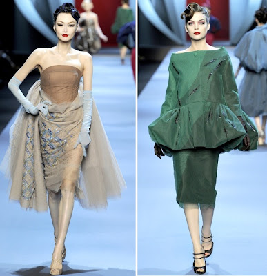 Dior also made use of the a-line silhouette in his later design life, which also changes the way a woman's body is framed. You can see both of these approaches in Galliano's designs; the silhouettes change the woman's body, but demand consideration of the more traditional form.
Details, Details, Details.
Galliano also uses little nods to details of past collections in his current ones, from construction to fabrics to references. I've included a couple notables below.
And of course, there are the flowers. Dior loved his garden, named his first collection after a circlet of blossoms, referred to his models as flowers, and spoke endlessly of floral influences on his work. One of my favorite recent couture shows at Galliano's hand was an ebullient display of flowers, with some quirky nods and updates, like the Dr. Seuss hair and the cellophane-looking headpieces reminiscent of a florist's wrappings. I'll close the post out with some of my favorite images from that show. Enjoy!


The following is an amateur analysis of connective threads between Dior's most iconic collection and Galliano's current work. It's not intended to be complete nor authoritative, but I think it's an interesting illustration. All modern images are pulled from Style.com, and the older images of the 1947 Corelle collection are from this wonderful blog post entitled "Dior's ring of petals: 'Flower women'" on A White Carousel, which talks about the game-changing Corelle collection. There are several other lovely photos on that post, and the whole blog is well worth a read.
Wasp Waists and Full Skirts
The Corelle line was Christian Dior's first, and it came out in 1947. It was immediately hailed as a revolution in fashion, not only for the styling but also because of the use of fabric. Fabric had been at a premium during the war and fashion had not yet returned to extravagant use. When you think of the 40s and 50s, you probably think of something like this:

 |
| I'd like to live in this ad. |
When a new designer comes to the helm of a house, the house gets another chance to consider the direction of their design. A new designer can reinvigorate a house, but generally, unless it is somehow imperiled, they'll want to retain some reference to the genesis of the house, presuming of course that it has a recognized image and style (not all houses have what you'd call a trademark or signature style). It can also be hard to update a house's style if that style was established in and is definitive of a certain era. I think Galliano's use of the wasp waisted silhouette with a full skirt manages to do this successfully, though of course it's hard to say whether the update works for everyday wear - try sitting down in your cubicle in one of these babies!


Details, Details, Details.
Galliano also uses little nods to details of past collections in his current ones, from construction to fabrics to references. I've included a couple notables below.
 |
| Tinkering with tailoring details; here manifest in a backwards facing neckline. |
 |
| Consistent shape of ball and formal gowns; a continuation of the wasp waist with a classic full skirt. |
 |
| Reference to a famous fishscale print (right); Galliano has made numerous adaptations of this print. |
 |
| References to Dior's lingerie history; Galliano created an entire couture collection that was based on lingerie (as seen above), an innovative way to incorporate the brand's history. |


Sunday, January 16, 2011
Accepting that Designated Book Day is Unlikely Day!: Learning to Fly, by Victoria Beckham
 So, here I am, foolishly thinking that I'll be able to like, read and stuff at my job as a receptionist, but in the three hours I had this book out on my desk, no less than seven people gave me crap about reading a book about Victoria Beckham. These people, I can only assume, are pitiably bereft of taste and sense. Listen, people, when the universe gives you someone who not only willingly bears the title of "Posh Spice" but then goes on to recreate herself as a fashion designing, Beckham marrying wearer of five inch, ZERO HEELED shoes, you pay attention, because this person is clearly an alien recently arrived from some advanced, loopy culture, a secret superninjagenius, or someone so balls-out bizarre as to be comedy gold.
This is not a great work of literature, but you don't need me to tell you that. What it IS, however, is a startlingly sweet memoir that tells the story of an interesting life in a funny and wholly endearing tone. I make no secret of my love for Victoria Beckham - I think she's hysterical - but I was surprised to find myself thinking that one need NOT be a fan beforehand. Some might find her style of writing somewhat insipid, particularly if you don't care for conversational tone in your books, but I am inclined to think that anyone would walk away from this book with the feeling of having had a peasant conversation with an interesting person.
Victoria Beckham's progression through life is pretty well-known if you swish an eyeball over any kind of pop culture magazine, are a Manchester United fan, or survived the Spice Girl onslaught of the 90s. She was a Spice Girl, met David Beckham, became a solo artist and fashion presence, and has remained on the edge of the glitterati-sphere ever since. There is a lot about her I didn't know, however, including her disordered eating and the truly horrifying threats of violence and kidnapping that the Beckhams endured.
Her frankness does her a great service as she talks about all of this. I really enjoyed her perspective on fame and the work required to achieve it. Rather than the usual gloss we get from magazines and fluffy interviews, Beckham freely admits that she both worked impossibly hard to achieve some kind of stage fame, and that she made many errors along the way. Even when she was in the Spice Girls, there were tough times and exhausting work schedules, and she outlines all of this while providing a glimpse into the industry perspective on the girl band and the way management handled them.
This same illuminating approach can be devastating as she discusses the rockiest parts of her life. Her account of her disordered eating includes both the physical effects and the chillingly mundane slide into those behaviors. She shares her struggle without glamorizing it or turning herself into a freakshow. Even more harrowing is her account of the threats received against her infant son, Brooklyn, and the bodyguard who betrayed the family. Originally taken on in response to those threats, the bodyguard was actually spying on the Beckham family, and later attempted to sell his records to biographer Andrew Morton. Writing this part of the book must have been very painful for Victoria, because her panic still comes through the pages years after the incident. I can't imagine how scary it must have been to have someone you trust implicitly turn on you so completely, AND to realize that he'd been conspiring against you through your entire relationship.
Overall, this is a breezy read of middling literary quality that makes up for it's weaknesses with the charm of it's subject. Of course, as an autobiography, it is one side of a story - I'm sure some of it's actors would have some complaints about their portrayal - but it's an interesting one, and gives some depth to a figure usually seen in gossip magazines alone.
Crossposted at the Outpost.
Wednesday, September 8, 2010
How To Get Dressed
I was clicking through what is now apparently my life's work on Suicide Blonde and came across this gorgeous shot of a coat Nicolas Ghesquière created for Balenciaga (photo by Nick Knight), and my immediate thought, after the reflexive "nnnngeh!" unspecific joy reaction, was that this is how clothing should make you feel. When I wear something I really love and am comfortable in, I feel like everything is light and glowing.
I shall make a note of this as the closet cleaning continues.

I shall make a note of this as the closet cleaning continues.

Tuesday, August 3, 2010
You Should Be Watching Suicide Blonde
I wish I could remember how I came across Suicide Blonde's Tumblr, but I can't. What I can tell you is that you should be watching it. She has a wonderful eye for art, photography and composition and I've been spending a lot of time paging through her almost 2000 pages of Tumblr.
There are a couple photographers she features frequently who I don't really like because I find their work either trite, faux-shocking and misogynistic (Terry Richardson) or just plain "yeah okay, but why?" and vaguely misogynistic (Ellen von Unwerth), but I know that there are plenty of people who like those two photographers' work and have made my peace with it. (Okay, perhaps not with Terry Richardson. I do not find his talent significant enough to counterbalance his general grossness, misogyny and relentless need to put himself into the frame. Also, sexually problematic. [Also also: Tavi Gevinson is spectacular.])
Here's a sampling of some favorites of mine.


There are a couple photographers she features frequently who I don't really like because I find their work either trite, faux-shocking and misogynistic (Terry Richardson) or just plain "yeah okay, but why?" and vaguely misogynistic (Ellen von Unwerth), but I know that there are plenty of people who like those two photographers' work and have made my peace with it. (Okay, perhaps not with Terry Richardson. I do not find his talent significant enough to counterbalance his general grossness, misogyny and relentless need to put himself into the frame. Also, sexually problematic. [Also also: Tavi Gevinson is spectacular.])
Here's a sampling of some favorites of mine.


Tuesday, July 6, 2010
Make Your Own Hair Phone to Contact Lady Gaga in Emergencies
Rich got me Lady Gaga tickets for graduation, and once I changed my pants and called The Lucy to reserve her presence for Fourth of July weekend, the inevitable thought came up..."holy shit, what do I WEAR?"
With the guaranteed heat of the weekend in mind, I figured the best way to go would be with exciting makeup and hair and a pretty basic outfit. I thought "man, it would be totally fucking awesome to make a hair phone like Gaga wore in the Telephone video," and fixed my mind on that. Here's how I did it.
YOU NEED:
1 phone
1 roll of packing tape
old-school Elmers glue
Xacto knife (or similar)
two or three of those clip on ponytails they sell at CVS or a wig
thread the color of the hair
PROCEED:
1. Put on Lady Gaga YouTube channel or CD/playlist.
2. Start with your phone. I used our old emergency phone downstairs because I liked the shape. I also found that older phones were more ergonomically shaped, which helps with later head-positioning; the mouthpiece is angled up slightly. Check it out - cool, right?
 Unplug said phone and take the handset off the hanger. Take short pieces of packing tape and wrap them around the handset STICKY SIDE OUT. I cannot overemphasize the importance of the sticky side out part. I found it helped to rip the pieces of tape lengthwise to get it worked into smaller areas of the phone. As a slightly obsessive person, I appreciate the need to get this "perfect" but you really should keep in mind that this will not show, and you can fold over points and such of the tape.
3. Wrap the phone again, this time with the non-sticky side out. You should be taping in the opposite direction from the first round of tape. For instance, if you wrapped counter-clockwise on the handle your first time around, go clockwise this time. Give the whole thing a good squeeze to even out any bumps. You'll wind up with this.
 4. Now is the somewhat delicate part: use your Xacto knife to cut along the taped phone so you can pull the phone out of its new tape shell. The tape will probably hitch up on you if you go too fast, so take your time and use lots of short, even cuts. It may not matter all that much about where you cut, but I went from the cord along the top spine of the phone, then made a second cut along the side of the listening end of the phone. Then, pull your phone out of the tape husk. Here's what it looks like. (Yes, I was watching RuPaul's Drag Race and a.) if you're not, your life is not as good as it could be, and b.) I feel like Ru would approve of this project.)
 5. Carefully tape over the cut so your phone holds together. You'll now have a solid and pretty structurally strong tape phone. Feel free to pretend you're calling people.
 6. This next part is not hard, but it is annoying and it's another danger zone for the perfectionists amongst us. THIS IS EXTREMELY MESSY. Take your hair bits and cut them off of their clips or wigs. Pour a ton of glue onto a plate. You are now going to drag the hair through the glue, then slop the hair onto the phone. After the first bunch of hair, take your thread and tie it around the phone. As you add hair, you should wrap the thread around it, working in the opposite direction of the hair (just like with the tape above). This will not be perfect! It will LOOK perfect in the end. I also did not worry about covering the flat surfaces of the phone - the parts you speak and listen to - because they would be along my head. The hair kind of curled under them anyway, so it had enough coverage to work. Let the whole thing dry.
 To attach it to my head, my friend Juls whipped up a bunch of victory rolls on my head, sprayed the bejesus out of my hair, then pinned the phone on by the hair covering it, now stiff with glue. It didn't budge all night and would have stayed through to the next morning if needed. It looked badass!
One thing I might change would be to do another covering of tape, sticky side out again to help grab the hair (which I would then "seal" with glue to be safe). Enjoy, Little Monsters!!
With the guaranteed heat of the weekend in mind, I figured the best way to go would be with exciting makeup and hair and a pretty basic outfit. I thought "man, it would be totally fucking awesome to make a hair phone like Gaga wore in the Telephone video," and fixed my mind on that. Here's how I did it.
YOU NEED:
1 phone
1 roll of packing tape
old-school Elmers glue
Xacto knife (or similar)
two or three of those clip on ponytails they sell at CVS or a wig
thread the color of the hair
PROCEED:
1. Put on Lady Gaga YouTube channel or CD/playlist.
2. Start with your phone. I used our old emergency phone downstairs because I liked the shape. I also found that older phones were more ergonomically shaped, which helps with later head-positioning; the mouthpiece is angled up slightly. Check it out - cool, right?
 Unplug said phone and take the handset off the hanger. Take short pieces of packing tape and wrap them around the handset STICKY SIDE OUT. I cannot overemphasize the importance of the sticky side out part. I found it helped to rip the pieces of tape lengthwise to get it worked into smaller areas of the phone. As a slightly obsessive person, I appreciate the need to get this "perfect" but you really should keep in mind that this will not show, and you can fold over points and such of the tape.
 3. Wrap the phone again, this time with the non-sticky side out. You should be taping in the opposite direction from the first round of tape. For instance, if you wrapped counter-clockwise on the handle your first time around, go clockwise this time. Give the whole thing a good squeeze to even out any bumps. You'll wind up with this.
 4. Now is the somewhat delicate part: use your Xacto knife to cut along the taped phone so you can pull the phone out of its new tape shell. The tape will probably hitch up on you if you go too fast, so take your time and use lots of short, even cuts. It may not matter all that much about where you cut, but I went from the cord along the top spine of the phone, then made a second cut along the side of the listening end of the phone. Then, pull your phone out of the tape husk. Here's what it looks like. (Yes, I was watching RuPaul's Drag Race and a.) if you're not, your life is not as good as it could be, and b.) I feel like Ru would approve of this project.)
 5. Carefully tape over the cut so your phone holds together. You'll now have a solid and pretty structurally strong tape phone. Feel free to pretend you're calling people.
 6. This next part is not hard, but it is annoying and it's another danger zone for the perfectionists amongst us. THIS IS EXTREMELY MESSY. Take your hair bits and cut them off of their clips or wigs. Pour a ton of glue onto a plate. You are now going to drag the hair through the glue, then slop the hair onto the phone. After the first bunch of hair, take your thread and tie it around the phone. As you add hair, you should wrap the thread around it, working in the opposite direction of the hair (just like with the tape above). This will not be perfect! It will LOOK perfect in the end. I also did not worry about covering the flat surfaces of the phone - the parts you speak and listen to - because they would be along my head. The hair kind of curled under them anyway, so it had enough coverage to work. Let the whole thing dry.
  To attach it to my head, my friend Juls whipped up a bunch of victory rolls on my head, sprayed the bejesus out of my hair, then pinned the phone on by the hair covering it, now stiff with glue. It didn't budge all night and would have stayed through to the next morning if needed. It looked badass!
One thing I might change would be to do another covering of tape, sticky side out again to help grab the hair (which I would then "seal" with glue to be safe). Enjoy, Little Monsters!!
Monday, March 22, 2010
Couture Week: Christian Dior
Christian Dior, routinely my favorite show, rebounded HARD from the last collection of lingerie and frippery that didn't do all that much for me. The love, she has been restored.
 Let's begin with accepting that deep in my creepy little heart, I am a complete elitist who would rather spend my time patrolling my vast estate seated side-saddle or snidely rebuffing the lower classes, so this whole collection appeals to me on a certain level that has little to do with fashion. I love the outsized top hat and the lovely subdued plaid, to say nothing of the glorious red jacket. Plus, it includes a crop with which to whack the street urchins with!
 More lovely grey plaid. I am not sure if this is intended as a dress or just as a coat but I'd wear either configuration in a heartbeat. I think this look may be the clearest "Hot Damn That Is Some Glorious Tailoring" demonstration of the collection...it's a relatively simple look but it fits perfectly.
 More dramatics in the red/grey/black palette, but the most interesting part to me is the jacket. I like the combination of the cutaway front and side fall.
 I hate these boots with this look, but I love the detail of the dress itself. I'm going through an intense Big Jewelry Phase, so the necklace is a big selling point here. I like the 1700's French influence and the inclusion of some of the transparency of fabric we saw in last year's couture show.
 Big hair, big hair, oh I love big hair! GREAT shade of pink, with lovely detail on the jacket. More use of transparent fabrics to great effect.
 Here we switch to deeper colors. I am all about teal these days, and I think it's lovely paired with the sweep of olive green. The coat reads very peacocky to me, I love it! The shoes are very cool too...I like when designers tinker with the fundamental shape of footwear.
 Holy shit, yes please. If I owned this, I would never not be having a cocktail party. The amethyst color is spectacular, and the detailed brocade in the top sets it off perfectly. I will be starting a petition encouraging people to wear opera gloves more often (to be paired with my petition for the wearing of more hats).
 I'm not sure how I feel about the swath of pink at the back of this, but the overall look is lovely. I kind of wish it was on a model with darker skin tone for more contrast, but I love the design itself enough that I can deal. The bustling of the skirt is gorgeous, and I love how sweet the bodice is.
 This makes me want to get married again (after hitting the lottery), and given my general apathy in the direction of Wedding Things that's quite a statement.
 Love the combo of shirt-dress, draped skirt and starry tulle on the underskirt! I usually hate this type of purple too, but contrasted with the darker shade underneath it's really lovely.
 The detail in the skirt on this is magnificent. I really admire the work that goes in to these gowns...it's so far beyond what normal humans are capable of. Seeing these seamstresses and tailors in action was one of the more interesting parts of Valentino: The Last Emperor. The designer may come up with the ideas, but the people who make those ideas come to life are just amazingly talented.
 Ever wanted to wear a universe? Me too! It looks like people of a certain income bracket are actually able to. It takes a lot of skirt to balance out a hip bow like that, but damn if it doesn't get pulled off here. Amazing.
 Let's begin with accepting that deep in my creepy little heart, I am a complete elitist who would rather spend my time patrolling my vast estate seated side-saddle or snidely rebuffing the lower classes, so this whole collection appeals to me on a certain level that has little to do with fashion. I love the outsized top hat and the lovely subdued plaid, to say nothing of the glorious red jacket. Plus, it includes a crop with which to whack the street urchins with!
 More lovely grey plaid. I am not sure if this is intended as a dress or just as a coat but I'd wear either configuration in a heartbeat. I think this look may be the clearest "Hot Damn That Is Some Glorious Tailoring" demonstration of the collection...it's a relatively simple look but it fits perfectly.
 More dramatics in the red/grey/black palette, but the most interesting part to me is the jacket. I like the combination of the cutaway front and side fall.
 I hate these boots with this look, but I love the detail of the dress itself. I'm going through an intense Big Jewelry Phase, so the necklace is a big selling point here. I like the 1700's French influence and the inclusion of some of the transparency of fabric we saw in last year's couture show.
 Big hair, big hair, oh I love big hair! GREAT shade of pink, with lovely detail on the jacket. More use of transparent fabrics to great effect.
 Here we switch to deeper colors. I am all about teal these days, and I think it's lovely paired with the sweep of olive green. The coat reads very peacocky to me, I love it! The shoes are very cool too...I like when designers tinker with the fundamental shape of footwear.
 Holy shit, yes please. If I owned this, I would never not be having a cocktail party. The amethyst color is spectacular, and the detailed brocade in the top sets it off perfectly. I will be starting a petition encouraging people to wear opera gloves more often (to be paired with my petition for the wearing of more hats).
 I'm not sure how I feel about the swath of pink at the back of this, but the overall look is lovely. I kind of wish it was on a model with darker skin tone for more contrast, but I love the design itself enough that I can deal. The bustling of the skirt is gorgeous, and I love how sweet the bodice is.
 This makes me want to get married again (after hitting the lottery), and given my general apathy in the direction of Wedding Things that's quite a statement.
  Love the combo of shirt-dress, draped skirt and starry tulle on the underskirt! I usually hate this type of purple too, but contrasted with the darker shade underneath it's really lovely.
 The detail in the skirt on this is magnificent. I really admire the work that goes in to these gowns...it's so far beyond what normal humans are capable of. Seeing these seamstresses and tailors in action was one of the more interesting parts of Valentino: The Last Emperor. The designer may come up with the ideas, but the people who make those ideas come to life are just amazingly talented.
  Ever wanted to wear a universe? Me too! It looks like people of a certain income bracket are actually able to. It takes a lot of skirt to balance out a hip bow like that, but damn if it doesn't get pulled off here. Amazing.
Friday, March 12, 2010
Couture Week: Valentino
Valentino's collection didn't do anything for me. I get that they're trying to redefine the house, but you can do that without eliminating the driving elements of the brand. Valentino has always been about glamour and sophistication. While there are virtues to designers like those in Rodarte who explore deconstructionist fashion and rougher inspirations, it seems strange for Valentino to lunge so suddenly in that direction.
 I like the flash of red and the floaty quality of the neutral fabrics, but the overall look leaves me cold. I kind of like the eyeshadow band and am not sure why. I am, however, sure that I like it for a reason I don't usually associate with Valentino.
 Interesting texture in the dress, but the boots are the real knockout. I love this color, and I like how delicate the upper is. The show was full of these weird little eye-bands, which I think are interesting for their air of seeming accessibility. I could almost see wearing one, but...where? And for what?
 Though I am anti-pantsuit, the ethereal feel of this look does have something special to it. The bodice in particular is gorgeous - the neutral colors and light fabrics make it look like the outfit is just barely swirling on to her.
 I included this because it was awful. This is like...Dickensian waif meets consumptive urchin, with a dash of overtanned-elderly-Floridian-boob and completely incoherent color palette. At least the utter failure to match colors was continued in the model's chest/face makeup pairing.
 This is better - I love the detailed fabricwork and the subdued green. The silhouette has something very 20s about it, but the fabric and particular detail updates it well. The shoes are particularly interesting. I think they look like plant leaves.
 This seems like a direct test of the Josie Responds To Color First theory...I like the capey thing and all its pretty colors and the neutrals are just enough in tone and volume to balance it out. The blue eyeshadow is really interesting as well. That particular shade really draws out the rich tones of the rest of the outfit.
 This, I enjoyed. It's the same color that was on the pretty boots above, and I just love the dramatic statement it makes. I even like the headband thingie.
I wish this collection had been...more.
 I like the flash of red and the floaty quality of the neutral fabrics, but the overall look leaves me cold. I kind of like the eyeshadow band and am not sure why. I am, however, sure that I like it for a reason I don't usually associate with Valentino.
 Interesting texture in the dress, but the boots are the real knockout. I love this color, and I like how delicate the upper is. The show was full of these weird little eye-bands, which I think are interesting for their air of seeming accessibility. I could almost see wearing one, but...where? And for what?
  Though I am anti-pantsuit, the ethereal feel of this look does have something special to it. The bodice in particular is gorgeous - the neutral colors and light fabrics make it look like the outfit is just barely swirling on to her.
 I included this because it was awful. This is like...Dickensian waif meets consumptive urchin, with a dash of overtanned-elderly-Floridian-boob and completely incoherent color palette. At least the utter failure to match colors was continued in the model's chest/face makeup pairing.
  This is better - I love the detailed fabricwork and the subdued green. The silhouette has something very 20s about it, but the fabric and particular detail updates it well. The shoes are particularly interesting. I think they look like plant leaves.
  This seems like a direct test of the Josie Responds To Color First theory...I like the capey thing and all its pretty colors and the neutrals are just enough in tone and volume to balance it out. The blue eyeshadow is really interesting as well. That particular shade really draws out the rich tones of the rest of the outfit.
 This, I enjoyed. It's the same color that was on the pretty boots above, and I just love the dramatic statement it makes. I even like the headband thingie.
I wish this collection had been...more.
Thursday, March 11, 2010
Couture Week: Jean Paul Gaultier
Well, Jean Paul Gaultier's collection felt a bit more up to date this year, but added a little bit of weird forced ethnic...situation.
 I feel like you can incorporate ethnic elements without being all "SOMBRERO" everywhere. Also, leggings are not pants. But I do love the color and cut of the jacket, and the boots are gorgeous. I even like the leggings/tights, I just don't like them in their role as pants.
 I hate most things about this, but I wanted to share these pants with you. There were a couple versions of them, but the wackiness is most evident here. I get the chaps reference, but it seems really obvious and forced. I do not hate the shirt, though I do hate the vest. Said shirt could be used to great effect in something that is not this.
 I thought this was an interesting shredded-up mantilla concept. I kind of like the skirt-pants-fringe situation...normally I hate the idea of catsuits but I think this one's really interesting and not aggressively catsuit-y.
 I love this suit. I don't know who could wear it, or to what, but it is GORGEOUS. That being said, I want to burn the sombrero along with the rest of them.
 This reminds me of Austin Scarlett's cornhusk dress. I think this is cool as hell and I'm so glad he left the damn sombreros out of it. There's real artistry here....I love that the center section is woven and then it all goes nuts at the top and the bottom.
 I LOVE this crazy headdress and the shoulder and leg armor. For some reason, I want to wear this all the damn time. I feel like I would accomplish more if I transacted my life in fashionable armor. The dress is unfortunately reminiscent of that sparkly fabric EVERYTHING was made of in the 90s, but I feel the armor makes up for it.
 I love the insane laser cut detailing. The muted color palette makes it so much more interesting. Once again, I love the hardware...the big chunky bracelets in particular are awesome.
 I feel like this is the kind of thing not accessible to normal humans, but Rhianna would rock it. The detailing is fascinating and I love the rich colors.
 More fascinating hardware, though I don't necessarily want the head...situation. I love the rich purple with the silver, and the whole effect is gorgeous even if it doesn't bear imagining what is required to get into it.
 Does anyone know who this human is? She appears to be a singer of some kind, but I do not recognize her. I think this is the only look in which the sombrero coheres, and I love how the bodice references beautiful Mexican embroidery. Super dramatic, and a great way to close the show. I think the choice of all red was a smart one...it really draws out the detail.
 I feel like you can incorporate ethnic elements without being all "SOMBRERO" everywhere. Also, leggings are not pants. But I do love the color and cut of the jacket, and the boots are gorgeous. I even like the leggings/tights, I just don't like them in their role as pants.
 I hate most things about this, but I wanted to share these pants with you. There were a couple versions of them, but the wackiness is most evident here. I get the chaps reference, but it seems really obvious and forced. I do not hate the shirt, though I do hate the vest. Said shirt could be used to great effect in something that is not this.
 I thought this was an interesting shredded-up mantilla concept. I kind of like the skirt-pants-fringe situation...normally I hate the idea of catsuits but I think this one's really interesting and not aggressively catsuit-y.
 I love this suit. I don't know who could wear it, or to what, but it is GORGEOUS. That being said, I want to burn the sombrero along with the rest of them.
 This reminds me of Austin Scarlett's cornhusk dress. I think this is cool as hell and I'm so glad he left the damn sombreros out of it. There's real artistry here....I love that the center section is woven and then it all goes nuts at the top and the bottom.
 I LOVE this crazy headdress and the shoulder and leg armor. For some reason, I want to wear this all the damn time. I feel like I would accomplish more if I transacted my life in fashionable armor. The dress is unfortunately reminiscent of that sparkly fabric EVERYTHING was made of in the 90s, but I feel the armor makes up for it.
 I love the insane laser cut detailing. The muted color palette makes it so much more interesting. Once again, I love the hardware...the big chunky bracelets in particular are awesome.
  I feel like this is the kind of thing not accessible to normal humans, but Rhianna would rock it. The detailing is fascinating and I love the rich colors.
  More fascinating hardware, though I don't necessarily want the head...situation. I love the rich purple with the silver, and the whole effect is gorgeous even if it doesn't bear imagining what is required to get into it.
  Does anyone know who this human is? She appears to be a singer of some kind, but I do not recognize her. I think this is the only look in which the sombrero coheres, and I love how the bodice references beautiful Mexican embroidery. Super dramatic, and a great way to close the show. I think the choice of all red was a smart one...it really draws out the detail.
Subscribe to:
Posts (Atom)


 Posts
Posts

