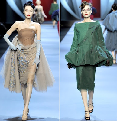
The following is an amateur analysis of connective threads between Dior's most iconic collection and Galliano's current work. It's not intended to be complete nor authoritative, but I think it's an interesting illustration. All modern images are pulled from Style.com, and the older images of the 1947 Corelle collection are from this wonderful blog post entitled "Dior's ring of petals: 'Flower women'" on A White Carousel, which talks about the game-changing Corelle collection. There are several other lovely photos on that post, and the whole blog is well worth a read.
Wasp Waists and Full Skirts
The Corelle line was Christian Dior's first, and it came out in 1947. It was immediately hailed as a revolution in fashion, not only for the styling but also because of the use of fabric. Fabric had been at a premium during the war and fashion had not yet returned to extravagant use. When you think of the 40s and 50s, you probably think of something like this:
 |
| I'd like to live in this ad. |
When a new designer comes to the helm of a house, the house gets another chance to consider the direction of their design. A new designer can reinvigorate a house, but generally, unless it is somehow imperiled, they'll want to retain some reference to the genesis of the house, presuming of course that it has a recognized image and style (not all houses have what you'd call a trademark or signature style). It can also be hard to update a house's style if that style was established in and is definitive of a certain era. I think Galliano's use of the wasp waisted silhouette with a full skirt manages to do this successfully, though of course it's hard to say whether the update works for everyday wear - try sitting down in your cubicle in one of these babies!
Body Modification and Re-Shaping
Dior's philosophy on the female form also manifested itself in adaptations to it. I'll leave the feminist analysis out of this for the time being, though there's plenty to discuss there (and not with Dior, but with the predominance of male fashion designers directing the way the female form "should" look...you can probably see what a worm hole that topic is), but I think that Dior's modification is particularly interesting for the way it worked. In the pictures above, you can see that Dior's modification is not necessarily about traditional methods of emphasizing "classic female curves" or a standard concept of a woman's silhouette, but rather playing with those classically feminine areas in a way that prompts the viewer to consider them in a new way.
Dior also made use of the a-line silhouette in his later design life, which also changes the way a woman's body is framed. You can see both of these approaches in Galliano's designs; the silhouettes change the woman's body, but demand consideration of the more traditional form.
Details, Details, Details.
Galliano also uses little nods to details of past collections in his current ones, from construction to fabrics to references. I've included a couple notables below.
 |
| Tinkering with tailoring details; here manifest in a backwards facing neckline. |
 |
| Consistent shape of ball and formal gowns; a continuation of the wasp waist with a classic full skirt. |
 |
| Reference to a famous fishscale print (right); Galliano has made numerous adaptations of this print. |
 |
| References to Dior's lingerie history; Galliano created an entire couture collection that was based on lingerie (as seen above), an innovative way to incorporate the brand's history. |


There was no crushing of dreams. If I owned that skirt I WOULD wear it in my office. And find a way to sit and keep the pleats.
ReplyDeleteGood! Yeah, the sitting without pleat-wrecking would be the challenge.
ReplyDeleteI had to downsize some of the photos - if you click through, you can see them full size!
fabulous post! very well put together.
ReplyDelete